Editor Store,上海/室内
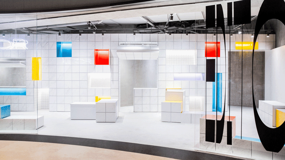
项目是Editor品牌创建后在上海的第一家实体店,也是全国第一家以“收纳”为主题的买手店。品牌的核心理念是提倡精致美学生活。
The project is Editor’s first retail store in Shanghai, being the first storage-themed Boutique in China. Editor’s core concept is advocating for aesthetics of quality living.
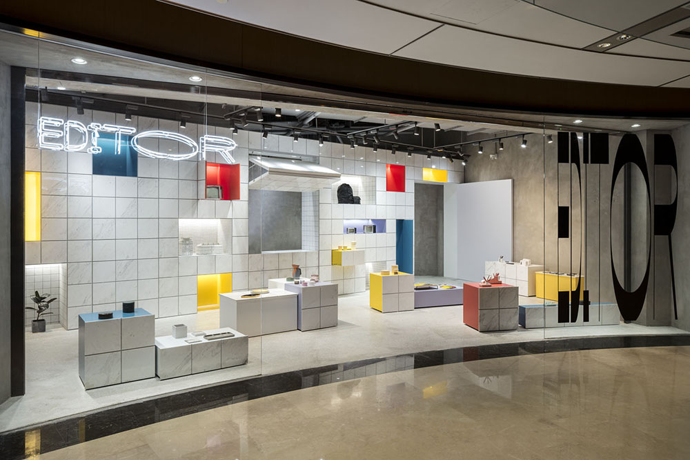
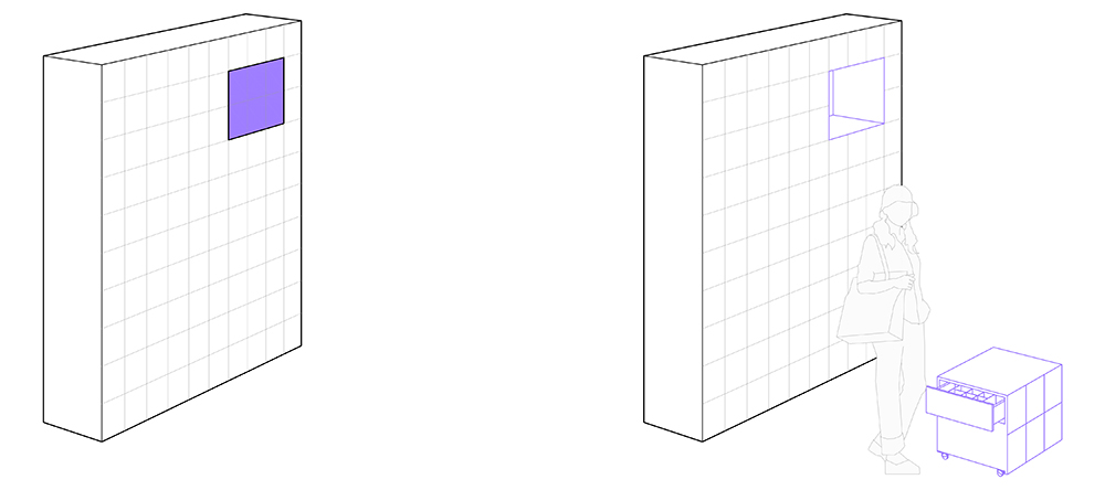
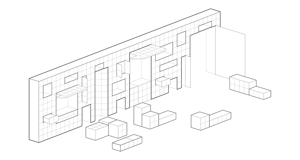
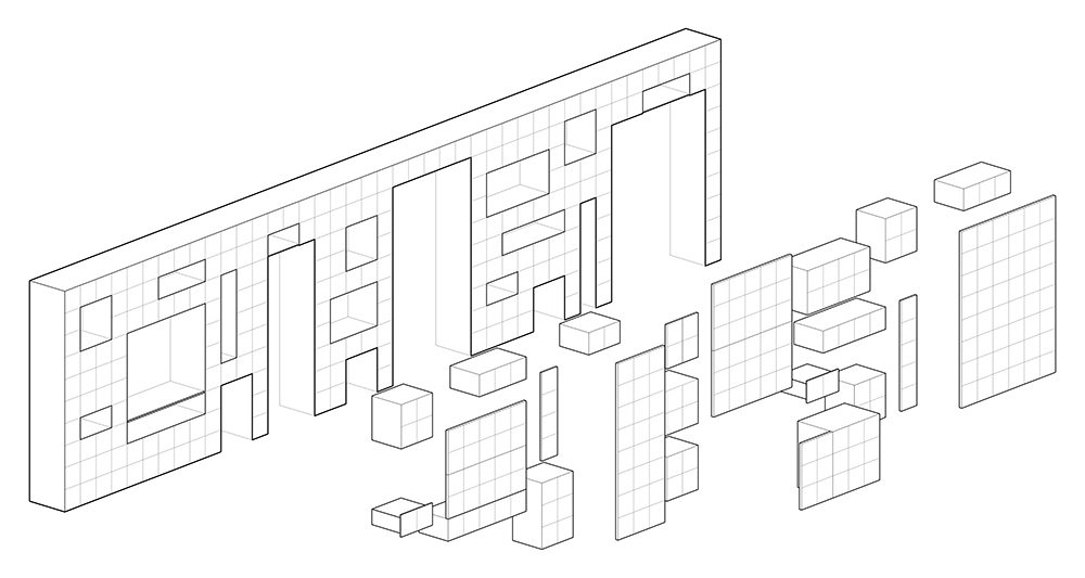
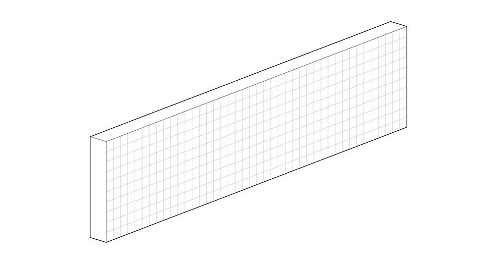
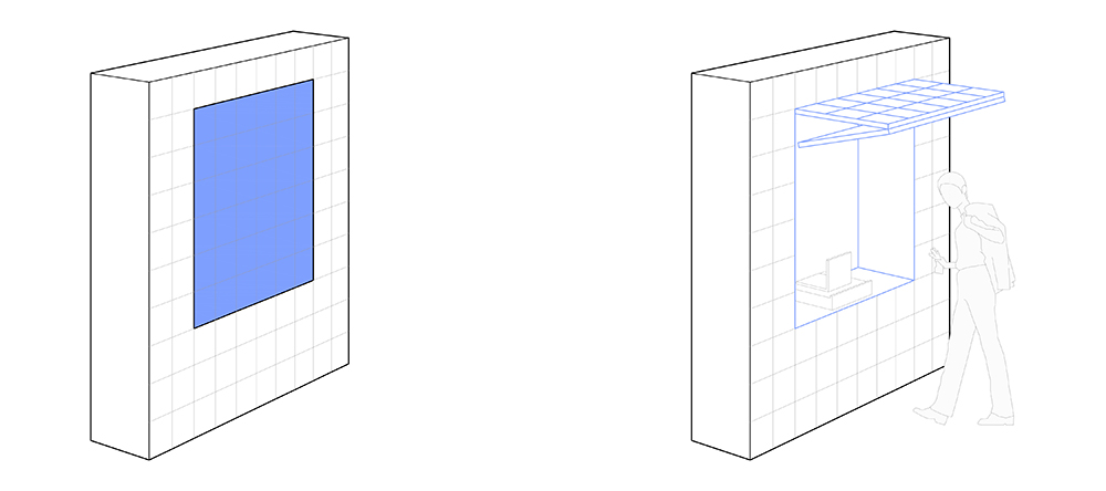
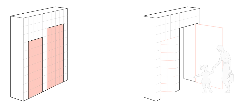
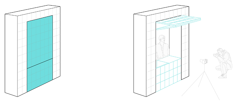
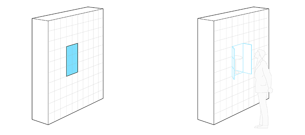
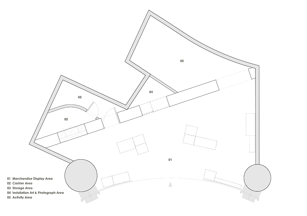
关于设计构思,平面上来看,将收银,商品陈列,以及活动拍照,通道这4种功能,归纳在一整面墙上。立面上来看,这面墙以编辑,构思和画画时所用的稿纸为灵感,以稿纸中的方格网为元素,将店内所需要的功能进行归纳和整理,形成了13个可以活动的不同大小的方格,这些方格可以放取,可以推拉,可以折叠,也可以打开和关闭。
The design by plan integrates four functions into a wall, including a cashier, product display, event photography, and a passage. The design by elevation is inspired by gird paper commonly used in design process (for editing, conceiving and drawing). The grid becomes the design element for the wall. Different functions are organized into thirteen movable grids of different sizes, which can be taken out and put back, pushed and pulled, folded and released, and opened and closed.
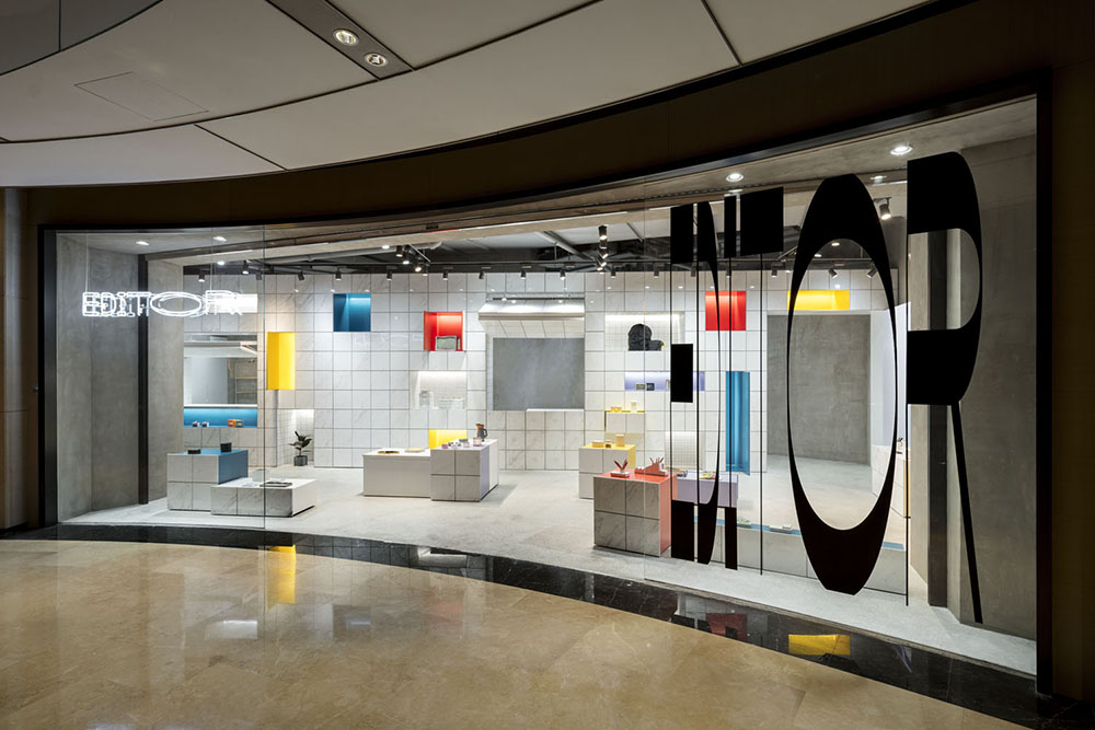
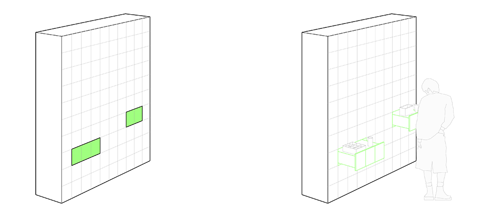
在材质和颜色上,整面墙使用了白色大理石来营造自然纯粹的整体效果,同时在可以活动的13个格子中,使用了不同规格的白色瓷砖,和Editor的四种VI颜色,借此打破白色墙面,简洁中富有变化。
In terms of the choice of material and color, white marble is used on the wall to create a spatial effect that is natural and pure. White tiles of different sizes are used in thirteen movable boxes with an addition of four brand colors, adding variations to the uniformed white wall.
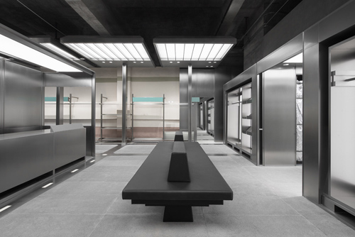
在整体的空间氛围上,除了中间的白色墙面,其余全部使用灰色调材料,浅灰色水磨石,水泥,灰色涂料,从色调上突出中间收纳为主题的白色墙面。
To create a sense of wholeness in spatial experience, an array of grey undertone materials are used, such as grey terrazzo, cement and grey paint, so that the white wall for storage stands out from the rest of the space.
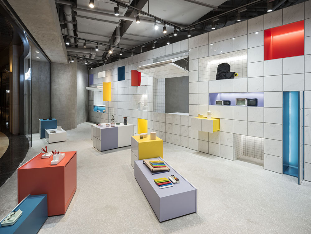
Editor新店的空间设计,着重突出了“收纳”的店面主题,以干净明亮的空间效果,传递纯粹简单的生活理念。
The design of the Editor store addresses the theme Storage by using simple elements to create a space that is tidy and lively (bright), and delivers a concept of refinery and simplicity for living.