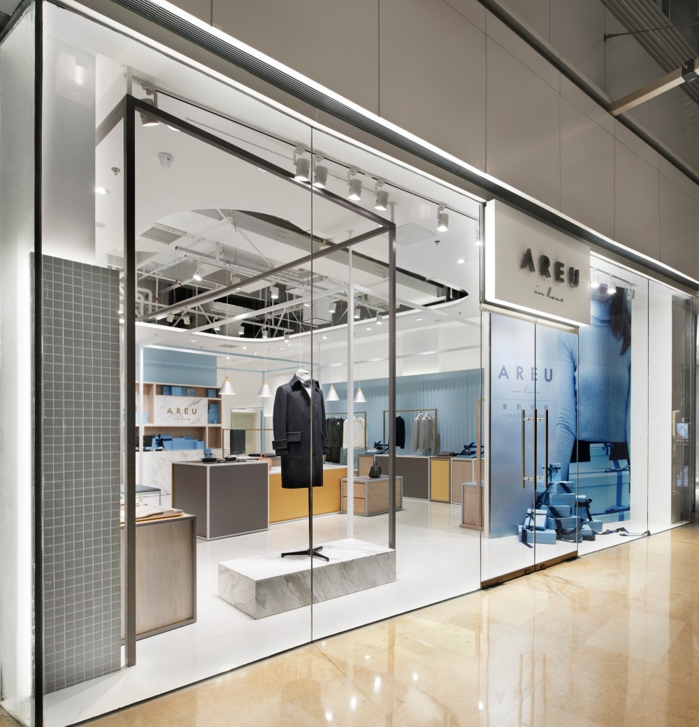
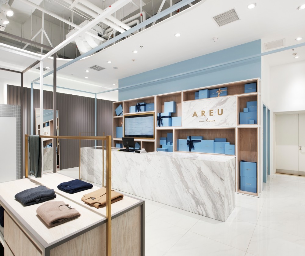
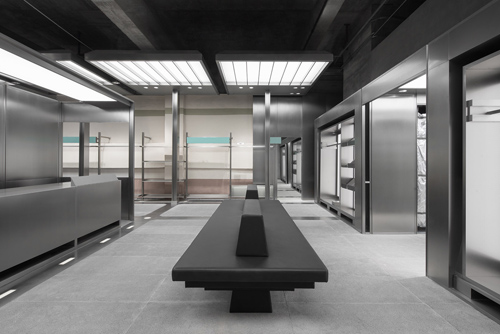
AREU北京頤堤港店,北京/室内
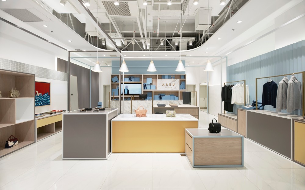
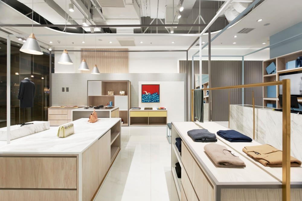
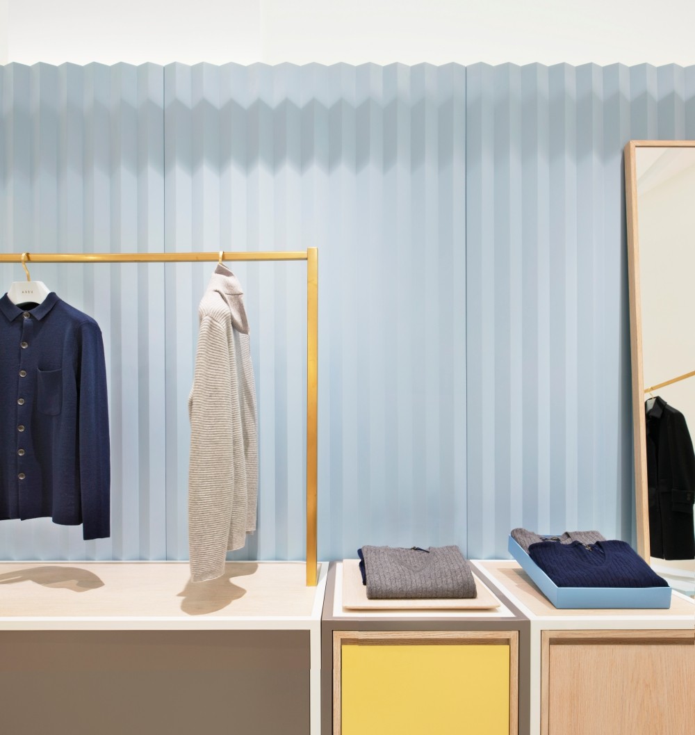
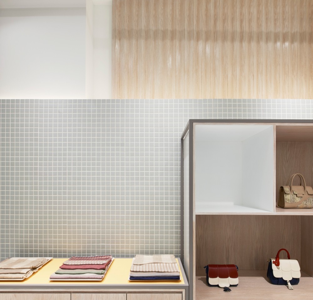
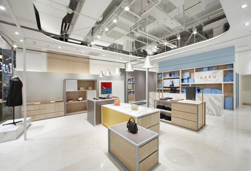
AREU产品主旨是帮助客人挑选并包装礼物送给他人,设计上围绕着“礼盒”的概念,将空间设计和品牌形象完美结合起来,从而创造出20个大大小小不同样式的“盒子”,灰蓝和金色是AREU品牌的主题颜色,再添加黄色、白色、灰色等过渡色调来丰富整个店铺视觉效果。
The aim of AREU branch is to help customers pick gift, package it, and send it to them. Starting from the concept of “gift box”, we combined spatial design with brand image, and created 20 “boxes” with different sizes and types. Glaucous blue and gold are the theme color of AREU, which also contains transition tones such as yellow, white and grey etc.
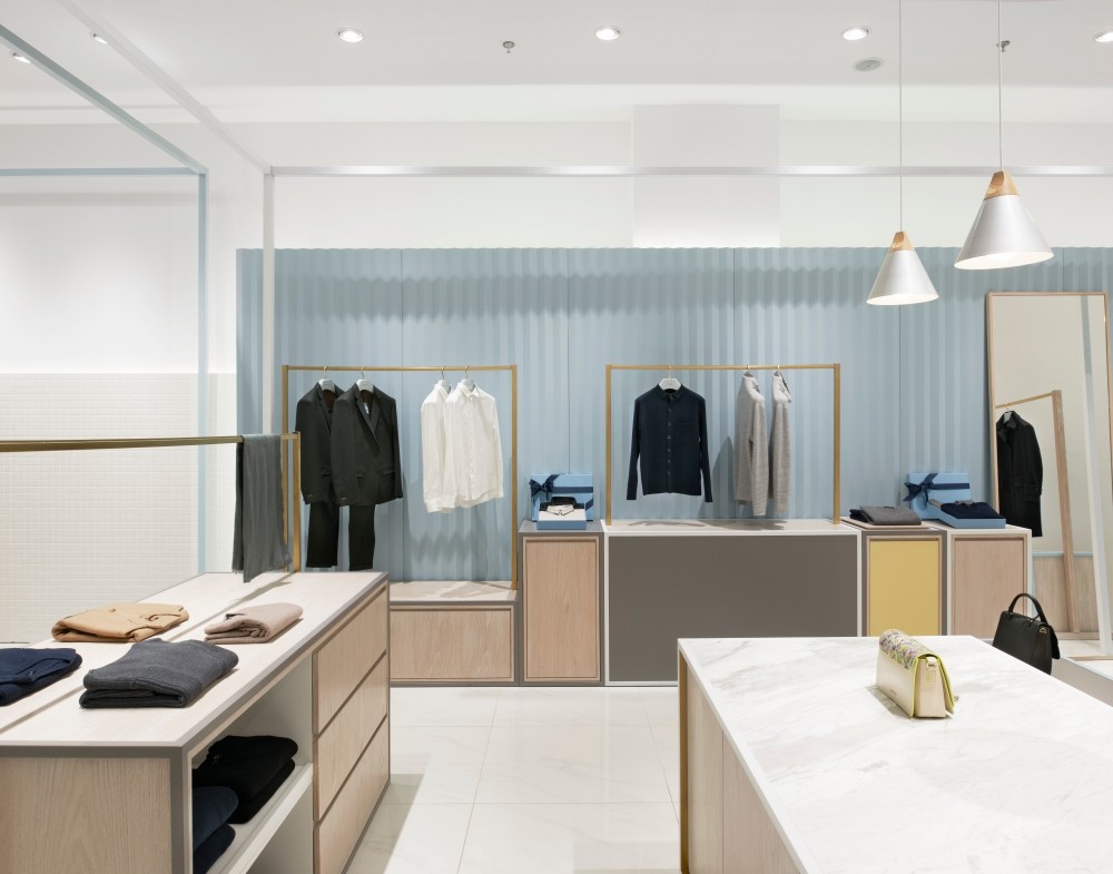
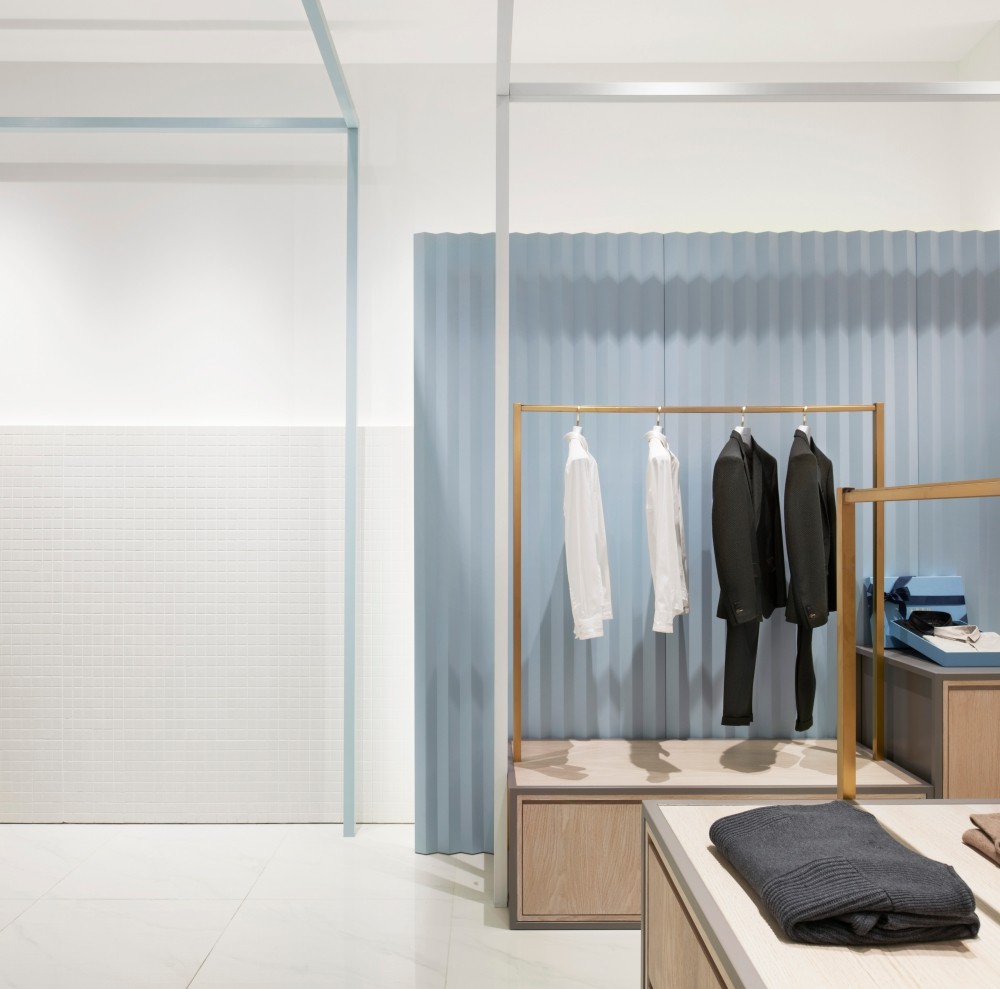
在一面墙体上粉刷不同质感、不同颜色的涂料,使墙面看起来参差有序,灯光的投射,让墙面富有层次感和立体感。
To make the interior wall richer in a stereoscopic feeling, the corresponding surfaces are painted in materials of different textures and colors.
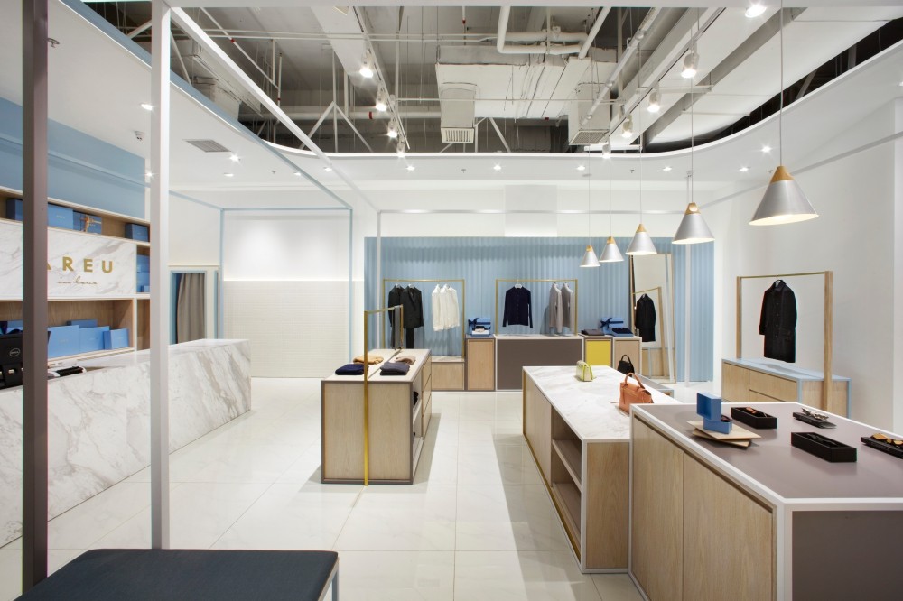
虽然都是常⻅见又简单的“盒子”,利用精致的细节设计反复强调这简单的20个“盒子”,使简单的东西变得生动富有灵气。
These surfaces that are irregular in sizes but organized in orders, together with the casting effect of artificial lights, add more hierarchies into the space. Though “boxes” are simple and common elements, detail design is a process aiming for “the simpler, the more elegant we should have”.